Brand identity, digital experience & social media direction
The Brief
Peplos Events came to Neon Era with a clear vision and a full brief - but nothing built yet. They knew their audience: discerning clients in Athens seeking premium, beautifully executed events with a genuine sense of place. What they needed was everything else.
The name Peplos was already chosen - a reference to the ancient Greek garment, worn with intention, draped with elegance. The brief was sophisticated. The brand did not yet exist.
My job was to build it from the ground up.
The Foundation
Starting from a target audience and a name, the first work was strategic. Who is Peplos for, exactly? What does it stand for beyond the service it delivers? What makes it the only choice rather than one of many?
The answers emerged from the brief and from going deeper into what premium events in Athens actually means - not international luxury imported and applied generically, but something rooted in the specific beauty, warmth, and cultural richness of the city itself. Athens has its own aesthetic language. Peplos needed to speak it fluently while feeling contemporary and confident.
That became the positioning: a premium events brand that is unmistakably Athenian - in its warmth, its references, its visual world - expressed with modern precision.

The Scope
Brand strategy and positioning. Color palette and typography system. Website design and build. Copywriting across every page. Social media strategy and direction. Photography art direction.
Built entirely from a brief and a name. Nothing existed before this engagement. Everything you see is the work.
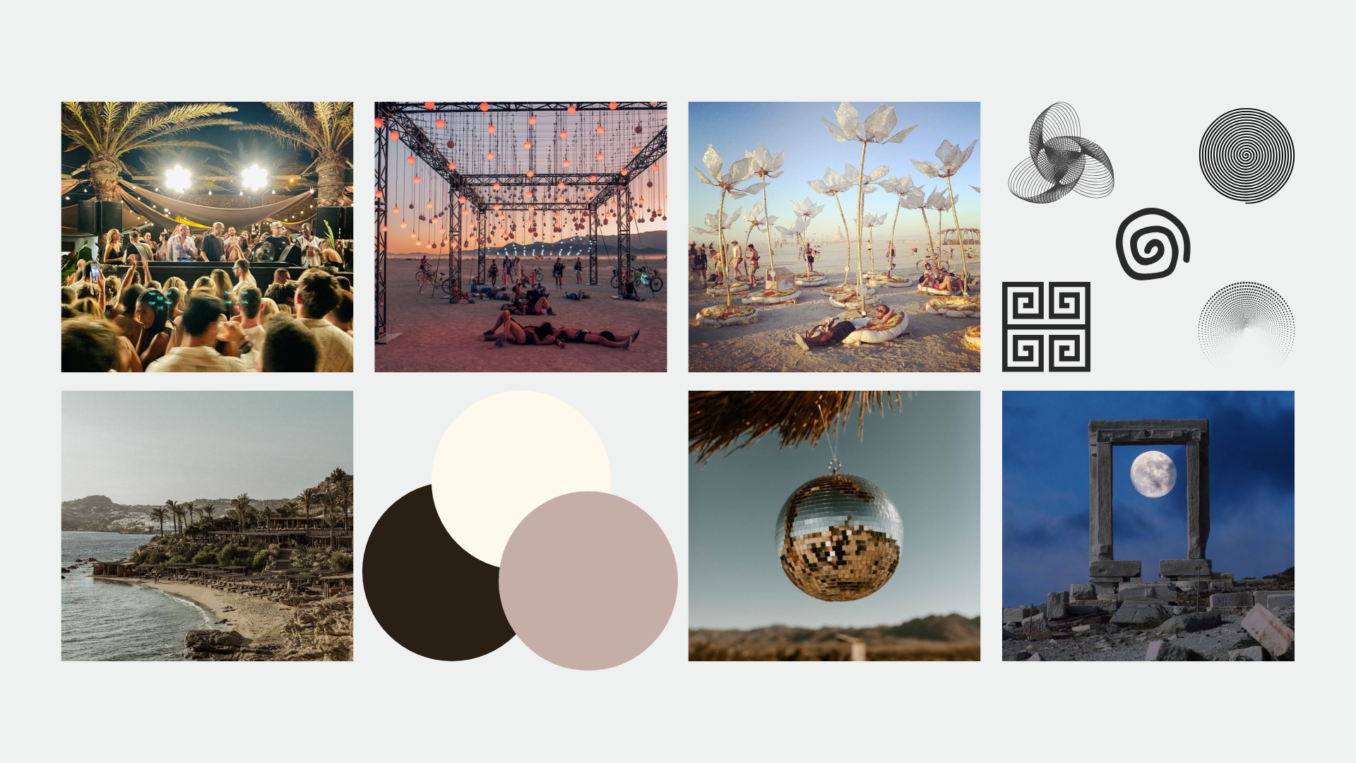
The color palette was drawn from the visual language of Athens - warm stone, deep Mediterranean blue, the particular gold of late afternoon light on marble. Not generic pastels but something specific, confident, and unmistakably placed.
The typography paired a classical serif carrying the weight of Greek heritage with a clean modern face - the tension between ancient reference and contemporary execution that sits at the heart of what Peplos is.
The website was designed as an arrival rather than a brochure. Premium event clients choose based on feeling first and logistics second - so every page was built to create atmosphere before presenting services. The copywriting was written entirely in the brand voice, establishing Peplos's tone from the first word a visitor reads.
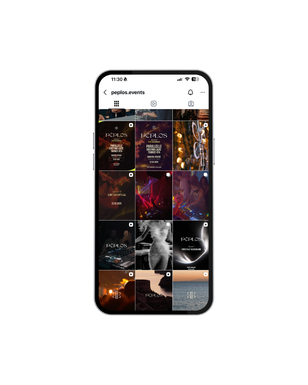
The social media strategy gave the brand a visual and editorial point of view for how to show up in a feed - not generic event photography but a specific aesthetic world that makes Peplos recognizable without needing to see the logo.
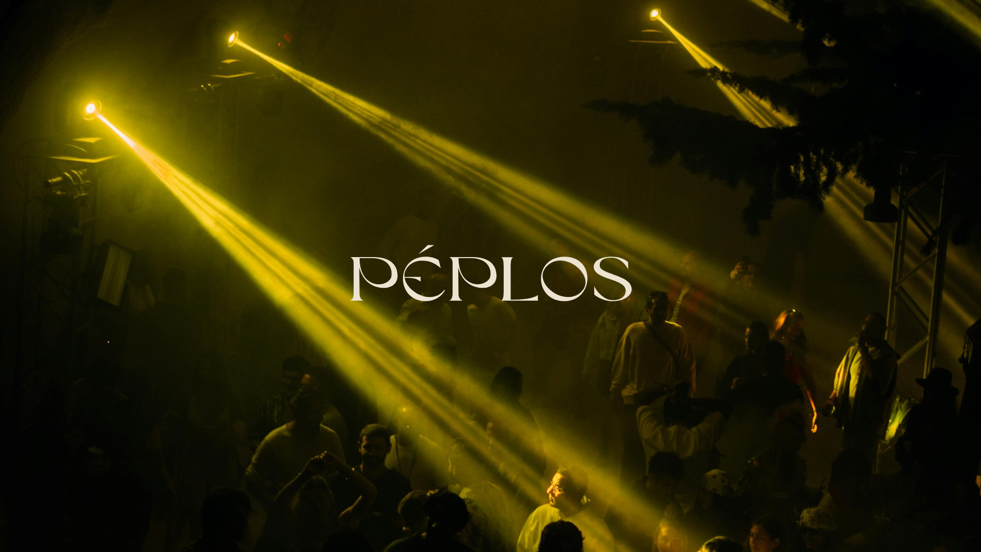
The photography art direction established the visual language for how Peplos events should be captured - the quality of light, the relationship between space and people, the moments that carry both warmth and precision simultaneously.
The Build