Brand redesign, digital experience & social media strategy
The Brief
Hypnosomatics is a mind-body healing practice based in New York - working at the intersection of hypnotherapy and somatic experience. The founder Katerina had been practicing for years and had built genuine expertise and a devoted client base. The brand, however, had not kept pace with the depth of the work.
The existing identity was inconsistent and didn't reflect the sophistication, warmth, or authority of what Hypnosomatics actually offered. The website wasn't converting. The social media had no coherent direction. The brand looked like a starting point rather than an established practice.
Katerina came to Neon Era for a full overhaul - not a refresh, a rebuild.
The Foundation
Before anything was redesigned, the strategic work came first. The question that mattered most: what is Hypnosomatics, exactly, and what makes it different from every other mind-body practice in its space?
The answer was specific. Katerina works at a rare intersection - not hypnotherapy alone, not somatic work alone, but the two in genuine integration. Her methodology addresses what the body holds that the mind cannot always access. The brand needed to reflect that depth without feeling clinical, and that warmth without feeling soft.
The positioning that emerged: Where the mind and body meet to heal. Confident, specific, and entirely true to what the practice actually does.
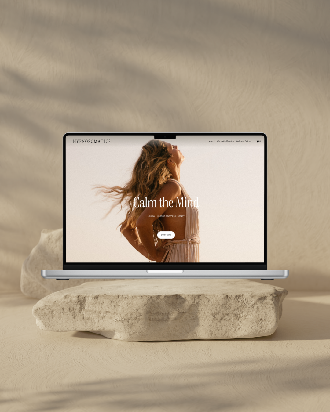
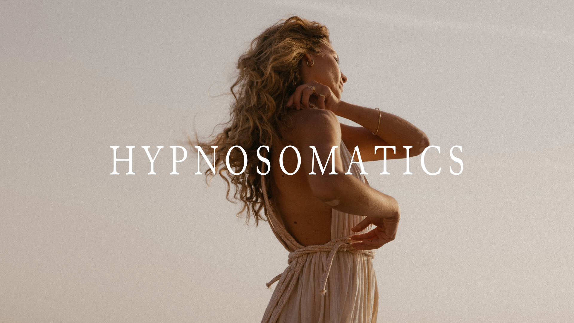
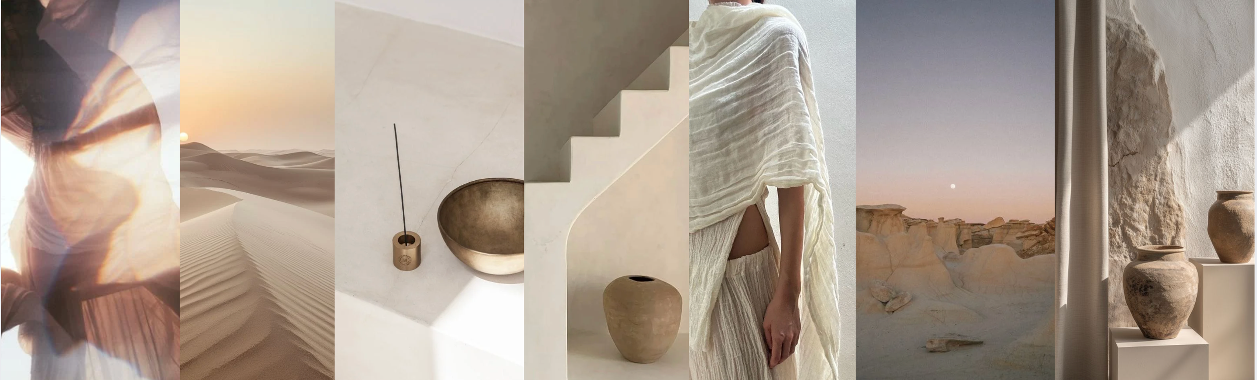
The aesthetic direction established from this foundation was Soft Nomadic Minimalism - warm, grounded, expert-led. A visual world that creates nervous system safety before it asks for engagement. Inspired by desert landscapes, natural textures, and the quiet authority of someone who has done their own deep work.
The Scope
Brand redesign - strategy, positioning, visual identity, colour palette, typography system, and brand guidelines.
Website redesign - full Squarespace rebuild with booking system integration and digital shop for audio and video products.
Social media strategy - content direction, posting themes, caption tone guidance, hashtag strategy, story framework, profile highlights structure, and a two-week relaunch plan.
The Build
The color palette was built around the aesthetic direction - soft warm whites and pale stone as the primary foundation, warm grey for secondary text, and a single scarlet red used with intention as the accent. Not for decoration but to guide attention and action. The palette was designed to prioritise nervous system safety - which is not incidental for a brand whose entire practice is about regulating the nervous system.
The typography system paired Instrument Serif - classical, considered, unhurried - with Almarai for body text and Fragment Mono for miscellaneous elements. A system with real hierarchy and real personality.
The website was rebuilt from the ground up - architecture, layout, copy direction, and full implementation including booking system integration and a digital shop for Katerina's audio and video products. Every structural decision was made with one priority: guide the visitor into a felt sense of safety before asking them to engage or book.
The social media strategy delivered a complete operational framework - six content themes with post examples and caption guidance, a hashtag strategy organised by content type, a story strategy with four distinct formats, a profile highlights structure with content mapped to each highlight, and a full two-week relaunch plan for introducing the new brand to her existing audience.